

Proposed experience for Snapchat
This proposed redesign solves critical usability hurdles in Snapchat by introducing clear navigation, explicitly labeled settings, separate feeds for stories and messages, and enhanced song controls. Designed as an academic UX evaluation in Boston, the revised interface eliminates confusing swipe patterns so users can interact smoothly and confidently.
Visual walkthrough of the revised interface
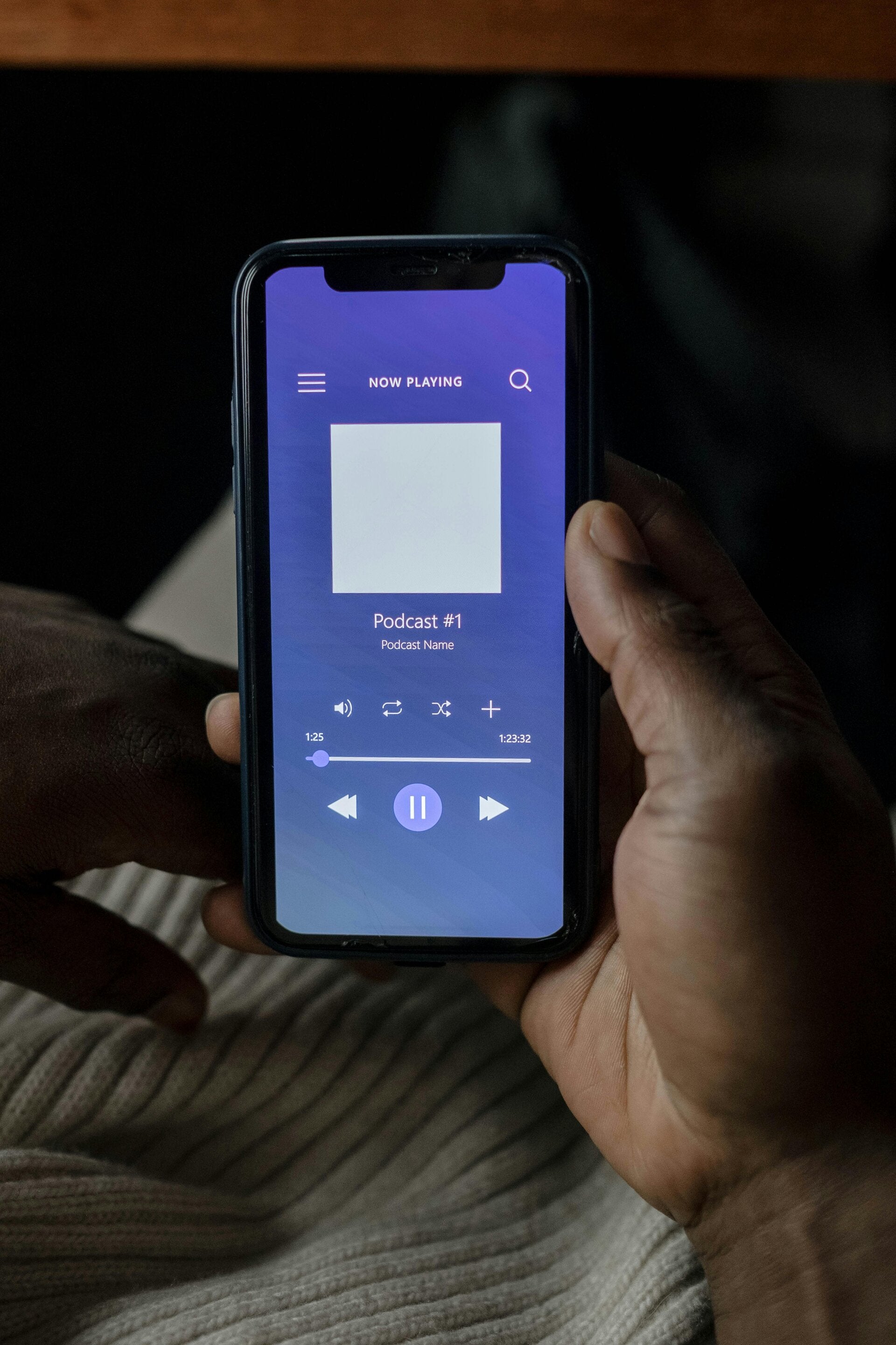
Explore the revised screens highlighting our visible settings icon, structured tab hierarchy, and intuitive audio playback tools.








Explore the research behind the prototype
See the full evaluation process, heuristic benchmarks, and user testing data that shaped this revised design solution.